UX Strategy

Making that great first impression is important.
Making every interaction after that even better is what drives all the user experiences and user interfaces that I help deliver.

Designer & Coder

You can never escape where you came from.
Self-taught hand-coder who stills loves to roll up my sleeves and dive head first into that dirty world of brackets and hexadecimals.

User Experience - A delighted user will make a good product great.

Low-fidelity wireframes to fully functional prototyping. Before costly development starts, I focus on the problem and delivering a solution for the business, customer and most importantly the end-user.


Design Approach

Design Approach

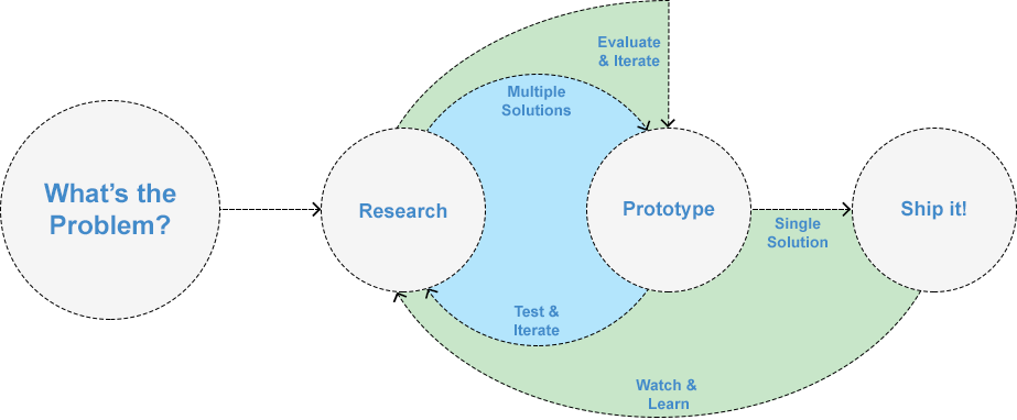
1. What's the problem we need to solve?

Clearly defining the problem in its simplest form will help focus efforts towards discovering a viable solution. If the problem is complex with multiple scenarios then break it down to multiple problems. Focus on solving for the majority of users first, the 80%, not for the outliers, the remaining 20%. Getting bogged down in the outliers and the many “what if” scenarios can impede progress and risk not solving any part of the problem. Building solutions that are looking for a problem to solve is not sustainable and runs the risk of weakening the product. The first solution implemented may not solve the entire problem, but to limit that risk it's important to research and really identify the core problem.

2. Research and have more than one solution

Just because one solution worked to fix a previous problem doesn't mean that's the same solution for another problem. Attacking a problem with the same knowledge and methods can be dangerous. Remember the first solution may not be the best. Continuously challenge a solution with research. Consider all scenarios but again build towards satisfying 80% of the audience. There's no such thing as an ideal solution but neither is every problem or scenario.

3. Prototype, Test, Iterate, Repeat

Make new mistakes but never repeat them. Prototyping is cheap, so take advantage and experiment. Quickly prototype an initial solution and then get it in the hands of people (internal and external sources). Prototypes fail when not used by people and most importantly by the targeted audience. That’s why it’s so beneficial to make a prototype as interactive as possible. Being able to click and manipulate the prototype to simulate the solution in a real world setting will not only help test the prototype but also the assumed scenario(s). The initial prototype will probably not be the final solution, but you need to start somewhere. The most viable solution is discovered through numerous rounds of testing and iterations.

4. Ship it and learn!

Once you have a viable solution it's time hand it off to development and QA. Iterations can still continue to happen during development as other pieces of the system come into play. Once the solution is in production and being used it’s time to start learning. Observe and learn from the people using the solution. Is it working as intended? Did it surface new/old problems? Can it be improved? Through tracking, analytics and general feedback you can start to identify future iterations. But it's important not to dwell. Again if the solution is satisfying 80% of the audience then that might be good enough. Through continuous learning and iterations you might be able to reach beyond that 80% but is it worth the efforts and cost?

Reference: Design Thinking... What is that?


Bryter CX - IRIS

IRIS

At Bryter CX I have been leading and working alongside the Design Team on the design and delivery of a new suite of products that provide a comprehensive and intelligent platform for companies to leverage big data. Our customers generate millions of user interactions across multiple channels and business lines and IRIS was designed to turn that data into valuable and actionable insights and analytics.

IRIS is a combination of current and new products that all needed to look and feel like a cohesive and engaging experience for current and new customers. It was paramount to establish a concise and flexible Design System to facilitate rapid development schedules but also handle numerous iterations based on user research and feedback from alpha and beta customers.

IRIS signifies an incredible and exciting turning point that will enable Bryter CX to provide a fully realized SaaS platform that will not only empower customers to self-manage but also self-facilitate their own successes within IRIS and across their organizations.

IRIS - User Flows

Spectrum (Charter) - MySpectrum App – Self-Install for New Internet Customers

New My Spectrum Internet customers had many options to setup and install their new Internet service. They could have a professional installation or install themselves. They also had the options to use their own modem or use the Spectrum provided modem.

In order to truly identify the pain points in the current workflows, I began researching and mapping out the user flows along with wireframes of the current screens in the mobile app.

The mobile channel was identified as the most used since the majority of customers had an exisiting Internet connection on their mobile devices that would enable them to setup and activate their new in-home Internet service. It was important to ensure that these new, current and returning customers had a frictionless and enjoyable setup process to not only prime them for success but also build their trust in the Spectrum brand and quality of service.

Self-Install for New Internet Customers

Once the wireframes and user flows were finalized we went through multiple iterations based on user research and in-person usability testing in user labs and online testing services. This was an incredibly rewarding project to be a part of and to use multiple phases of Design Thinking to produce multiple solutions for customers that would greatly enhance their overall experiences and had a measurable impact on customer call-ins and unsuccessful installations.


Spectrum (Charter) - Spectrum Ready – New Resident

A new product line that I was able to work on from the initial phases was Spectrum Ready. This is a product line specifically tailored for multi-resident dwellings (apartments, condos, etc.) that already had Spectrum Internet and TV services enabled in the individual units but required residents to sign-up for the service and activate their own personal accounts.

Since this was a new service it was necessary to start with persona driven Journey Maps that would present a proposed process for new residents to follow. There were many unknowns and potential restrictions given the environments and third-party residential managers. It was extremely beneficial to start with properly identifying key personas and their process from preparing to move, moving day and finally setting up the service in their new residence.

Spectrum Ready - New Resident - Journey Map

We wanted to ensure that everything was ready for them as soon as they got to their new residence so that we would not be adding additional stress to the already hectic process of moving. This again was focused on establishing and reinforcing the Spectrum brand and ease of service and support.


SCRAM Systems - Client Mobile App

A suite of mobile solutions for Clients

In order to tap into the 20,000+ market of low risk offenders (Clients) a mobile solution is needed to match their lifestyle and for a low-cost monitoring option.

The Problem

Low risk offenders are usually first time offenders and do not need a more intensive monitoring. Officers need a low-cost, less intensive and easy to manage option for this growing population so they can focus on the high risk offenders that demand intensive supervision.

The Solution

A suite of less-intensive mobile applications that could integrate with the mobile lifestyle of these low risk clients.

The Project

SCRAM Systems second mobile platform product but the first truly customer (client) focused product suite. Up to this point SCRAM Systems has never directly engaged with the clients of our customers. We are providing a direct solution for this popluation of clients on an entirely new delivery platform, their mobile devices.

Check-In
Messaging
Messaging
Reminders

As an alternative to more intensive monitoring or even serving time in prison, low-risk offenders (clients) can be monitored by their mobile devices. This provides a less disruptive option for officers to routinely maintain a minimal level of contact and engagement with this population.

Having a fully logged and accessible Messaging app allows multiple Officers to contact a Client directly at any time. This drastically reduces the need to setup in-person visits and phone calls.

To further reduce the logistics of printing out schedules for appointments and other notifications the Reminders app places the responsibility on the Client to make sure they are adhering to the terms of their probation.

The newest addition is the Check-In app. This can be scheduled and self-initiated by the Client to confirm their information. At the time of Check-In the GPS location of the phone is also captured so the Officer can see where the Check-In was taken. If any of the Client's information has changed the Officer is able to verify and update accordingly. This used to be a daily to monthly phone call or office visit, but is now a more sustainable solution that is less disruptive for the Client but also for the Officer. This solution has gone through multiple rounds of iterations based on direct customer feedback during an extensive beta process.

Throughout this process, assumptions and requests were continuously validated and tested so that we could provide the best possible solution that is viable for our business but also valuable to our customers and accessible by their clients.


SCRAM Systems - 24/7

24/7

Monitoring thousands of offenders everyday.

A new product designed for efficieny and empowerment of Officers to monitor thousands of offenders with breath tests, drug tests and electronic monitoring.

The Problem

Our customer’s current software was quickly reaching it's end of life and they needed a new software solution to manage their 24/7 offender management program. The new software needed to be ass efficient and accessible as their current software or adoption would suffer along with the productivity and viability of the state-wide program.

The Solution

A new software product that was fast, accessible and modern. Focusing on quick and easy to comprehend single task completion the SCRAM 24/7 product was born.

The Project

More than a year ago I was directly involved in customer visits to see how the Officers used their current software and interacted with offenders across 48 hours at multiple locations. Based on this research and Officer interviews and observations I began building interactive prototypes to test out our potential solutions.

First Prototype based on initial customer visit

First Prototype based on initial customer visit

Prototype before final Product Launch

Prototype before final Product Launch

Working directly with the Product Team and the customer we continued to iterate through the initial prototypes to ensure we were building a new system that was more efficient and usable then the old system. A big factor in any replacement system is user adoption and acknowledging current muscle memory in order to facilitate the acceptance and adoption of the new system.

When development began we established phases that would include direct customer and user feedback. Users would be able to test out the software at key milestones that would give us valuable insight into work flows and use cases. Those everyday scenarios, planned and unplanned, were discovered, explored and addressed on a weekly (sometimes daily) basis. This allowed us to build a productive relationship with the customer and the Officers that facilitated a dynamic and collaborative environment.


SCRAM Systems - Optix

Optometrist Machine

The Problem

As our customers take advantage of all of our products and services it will become increasingly difficult for them to measure and appreciate the increased amount of data that is generated.

The Process

I originally came up with the metaphor for Optix after a visit to the optometrist. As I was sitting in the chair staring through the optometrist machine and looking through the different prescription lens it dawned on me. Our customers would need to have different views into our systems. Some would need an elevated but wide view and others would need a very deep and focused view. But they would also need the ability to seamlessly switch between those views, focusing and refocusing on different levels of data and content. So, through that metaphor the product delivery platform of Optix was born.

I then had the challenge of communicating that vision to the Executive staff on down to the Product and Development teams. It was a brand-new concept for a company that was transitioning to software from a long legacy of hardware. I needed to demonstrate the validity of this new concept and platform but also showcase how it could evolve as our business and customers’ needs grew.

Optix - Initial Concept Prototype

Rapid prototyping was used to solicit cross-team buy-in and support. This included technical discussions (how we were going to build it) to Sales and Marketing discussions. In the end (or the beginning depending on how you look at it) it took the entire organization to launch Optix. It was a significant milestone for the organization and Optix is still growing a year later. It will continue to be our delivery platform for exciting new software products, but more poignantly a platform for UX and Design to continue to deliver consistent, coherent and delightful experiences to our current and future customers.

Optix

The Solution

A new destination that will increase our customers’ acumen across all of our current and future products and services.

A new way of seeing

A single destination that delivers vision, focus and clarity into the content that is most important to our customers.

Components of Optix

  1. Light Source
    1. Provides the content.
    2. Content can be pushed to and pulled from multiple Light Sources from internal (SCRAMnet, SCRAM GPS) or external providers.
    3. Light Sources can provide any amount and type of content.
    4. Any interruption in the delivery of content from a Light Source should not affect the integrity of our products and services.
  2. Theme
    1. Provides vision and focus.
    2. Themes define the access and permissions to a given range of Light Sources.
    3. Themes can be personalized.
    4. Themes can be customized and shared with other users.
  3. Lens/Tiles
    1. Provides clarity.
    2. A modular element able to process content from a single to multiple Light Sources.
    3. Content can be manipulated directly and indirectly through a Lens/Tiles.
    4. Lenses/Tiles can be connected to other Lenses/Tiles and directly and indirectly effect their content.
    5. Lenses/Tiles can be personalized.
    6. Lenses/Tiles can be customized then shared with other users.

SCRAM Systems - Officer Mobile App

A mobile solution for Officers

Officers are not always at their desk, but they still need a way to monitor and manage offenders.

The Problem

Our customers are constantly on the move, and so are their offenders. How can they manage them and the alerts they generate while away from their desks?

The Solution

A mobile app solution can give the Officer the flexibility to keep moving but still keep a watchful eye on their caseload and offenders.

The Project

This was the first mobile app for SCRAM Systems and was a great opportunity for me to apply my previous mobile experience. Being very empathetic to the audience, a Probation Officer, we needed to build a solution that would fit their daily routines but also technology acumen.

Officer's Mobile Dashboard
Remote Breath Alert List
Remote Breath Alert Details
GPS Alert Details

It was paramount that an Officer could manage alerts from all four of our monitoring products from one location. It was even more important to allow them to manage those alerts and to facilitate quick task completion. You can't set out to capture or reproduce a desktop experience on a mobile device. You need to focus on key tasks and provide and efficient and intuitive workflow so that the mobile users can stay effective and accomplished.

The Officer Mobile app currently has hundreds of users per month with an average session time of 5-10 minutes. This may seem like modest usage but for an audience that is new to mobile apps as a part of their daily routines this is a great trend. The average session time was intended to be "low" because we needed Officer's to get in and out of the Mobile app quickly and efficiently. The session times and number of sessions throughout the day are beginning to track this encouraged behavior and we continue to work on a backlog of Officer suggested enhancements.


CaféWell

CaféWell.com - The Redesign

The Redesign

I worked with a small team to redesign the CaféWell flagship website in 2012.

In less then 4 months, the team overhauled the site's information architecture, addressed numerous usability issues and created a completely refreshed visual design. My role was to create a prototype that incorporated final designs (that were based on early versions of the prototype where I worked through UX and UI solutions), a completely functional front-end and a digital style guide.

The prototype was used as the initial build of the site and the digital style guide is now a living document that is used by the dev team on a daily basis. CaféWell.com


Oliver Wyman Conference

Oliver Wyman Conference - Pedometer Competition Mobile Experience

Pedometer Competition Mobile Experience

At CaféWell our client Oliver Wymann was sponsoring a conference for many prominent health care providers. To enhance the 2 day conference I worked with a freelance developer to rapidly prototype a mobile experience that would leverage a Fitbit pedometer to create a friendly competition among the conference attendees. The first iteration was built in roughly 2 weeks and was a huge success. It increased engagement throughout the conference to such a degree we were tasked with creating a new version for a second conference.

The example shown here is the second iteration that included more robust stats, a chat wall, and a more refined overall user experience. It was again a huge success with almost all of the attendees participating in the competition.


Arrow Electronics

Arrow Electronics - Global Landing Page

Global Landing Page

The Arrow Electronics, Inc. homepage was in need of a redesign to make the initial region selection more intuitive while allowing for more marketing and SEO flexibility. I designed a new page design with a dropdown that clearly highlighted a map to let the user know if their country was included in that region. In the previous version a user had to specifically select their country from a full list of countries even though there were only 3 versions of the site for each of the three regions.

Although it wasn't implemented while I was there a slightly revised version is now live at: components.arrow.com


MoneyGram International

MoneyGram International - Portugal Prospect

Portugal Prospect

MoneyGram International was launching a new marketing campaign in Portugal and needed a marketing focused landing page that would explain the new money transferring services in Portugal.

The online components leveraged a printed brochure that was converted into a robust online experience.

The customer journey had varying branches depending on which country they were originating from and the landing page was offered in multiple languages.